I enjoy creating and reading newsletters, especially in print. There’s a skill to crafting text that's accessible for both the most loyal readers and the uninitiated, and a design that can entice those different audiences into perusing the publication and learning more about an organization. I started working on Village Preservation’s multipanel newsletter upon my arrival in 2021 and almost immediately gave the document a light redesign to improve readability, with such new elements as four-color rather than two, more room for photos, and easy-to-find URLs to draw people to our website.
In late 2024, I redesigned the newsletter from top to bottom, with the goal of getting more readers to pick up each issue at distribution points across Manhattan and discover our accomplishments. The newsletter now features a full cover image that lures more eyeballs than a page of text, a smaller physical size with more pages saddle-stitched to let people easily flip through many different projects, and better use of color and type throughout, among other user-friendly elements.
(And of course, I also assemble and manage e-newsletters.)
Skills: Design + Editorial + Photography + Editorial/Design Management
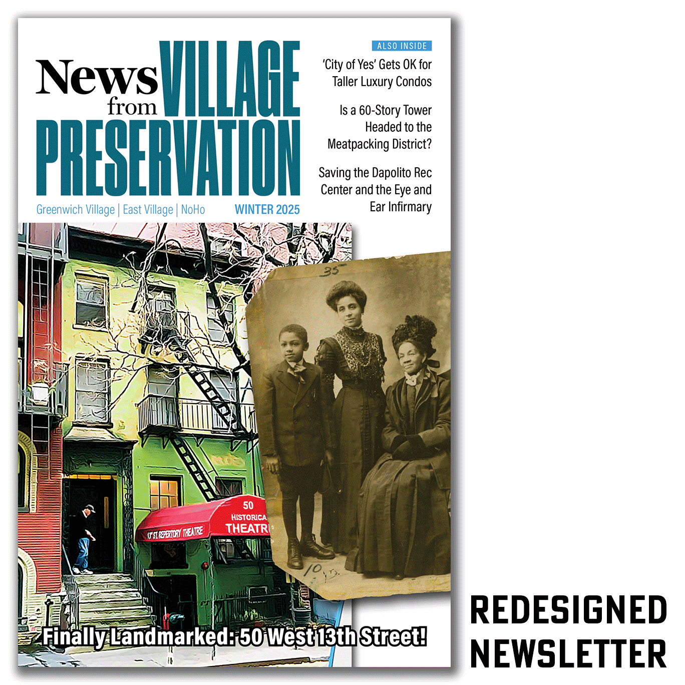
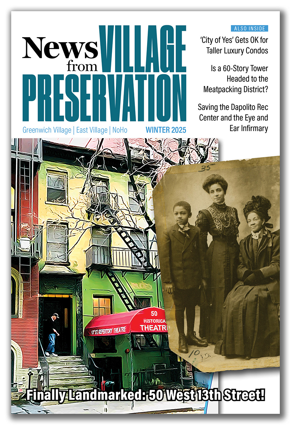
Cover, Winter 2025 (redesigned)
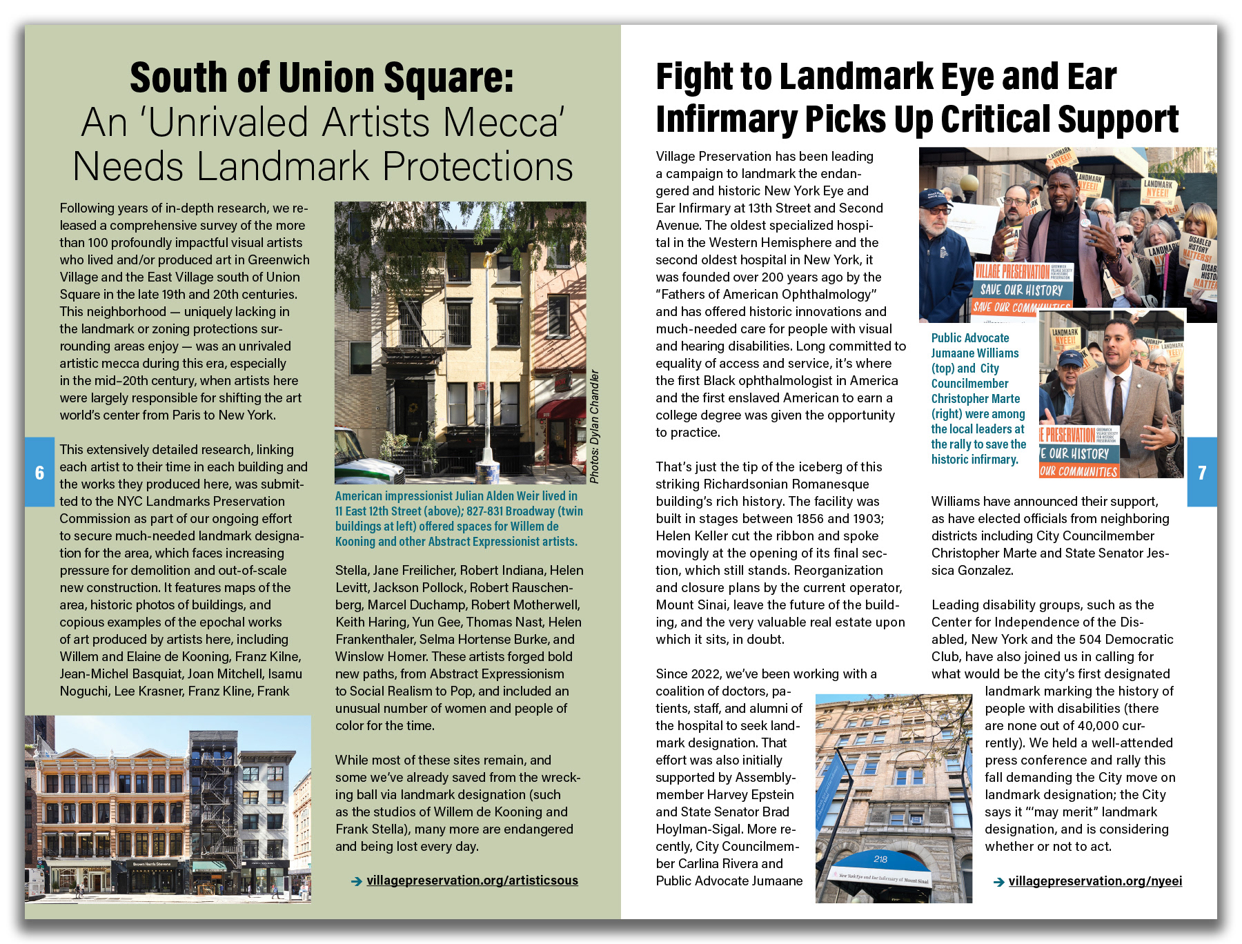
Pages 6-7 (individual stories), Winter 2025 (redesign)
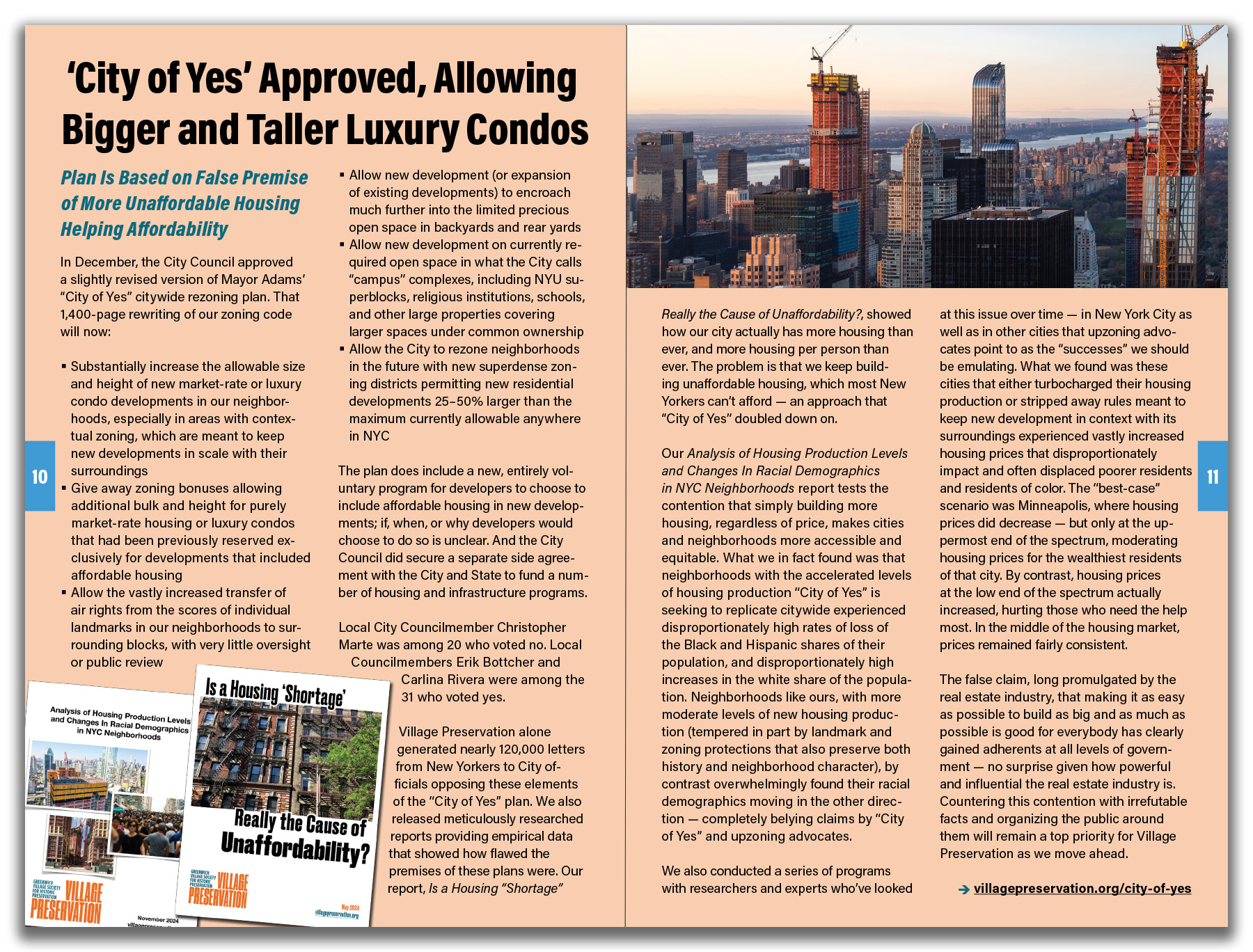
Pages 10-11 (spread), Winter 2025 (redesign)
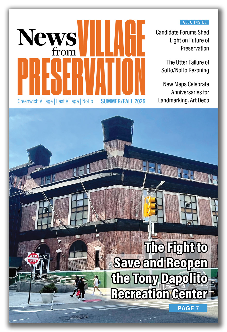
Cover, Summer 2025 (redesigned)
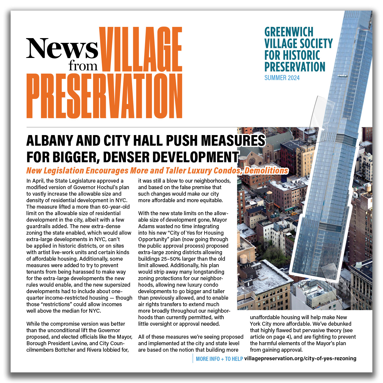
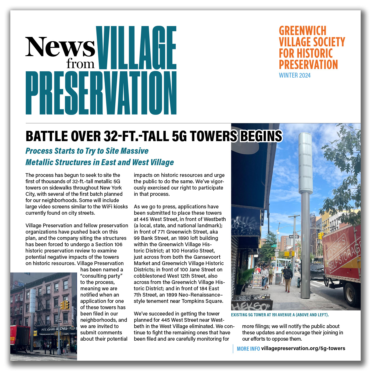
Cover, Summer 2024
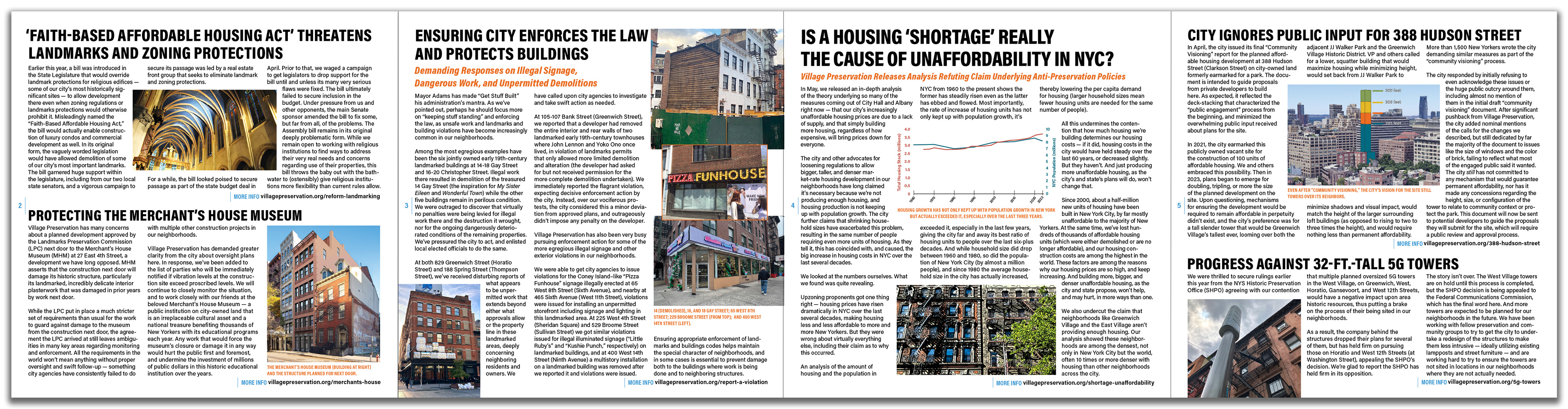
Pages 2-5 (interior pages), Summer 2024